The beginning
To tell this story, we need to go back a couple of years to a call in the last week of October 2021.
It was Valen telling me:
– "Juli... I have the idea, this time I really have the idea. We're going to do something big, something incredible!"
I didn't quite understand the rest, to be honest. A designer listening to someone talk about structured debt as if it were chewing gum and blowing bubbles. We agreed to talk about the topic again in the coming days. Little did we know that what was coming would be crazy. The next call was a bombshell to my ears:
– "Juli, I need to have the logo and the deck with which I'm going to present this idea to people who might recognize it and could finance us. Can you imagine if we manage to raise 500K USD?"
– Valen, how much time do I have?
– No more than two weeks.
Here came my agency mindset for mass consumption; my clients typically needed everything urgently and done well. The school experience during the pandemic had triggered in me a sense of getting things done as quickly as possible.
And the marathon began... You can imagine, Valen had a thousand ideas every day. On November 17th, we had the first brief; it was no coincidence, it was a special day for me, those who know me understand the reason. It was a simple brief (I'll leave it here), and the rest were daily conversations that nourished it in my attempt to understand, at least, the purpose of this company that was about to be born.
From the beginning, we knew the name was going to be Vaas, Valentina As A Service. Controversial enough, many have said it's too egotistical, that it's a "vanity project" name; others, like me, loved it. The name was short, super flexible, impactful, and full of personality—very 'Valentinesco.'
I invited a person who had accompanied me on several projects at the agency, who has since become part of our product team (Gus). He was passionate about everything related to experience, and I needed to alleviate my anxiety about creating the brand that Valen envisioned.
The proposals started after we conceptualized that brief; we went through several... see for yourselves:
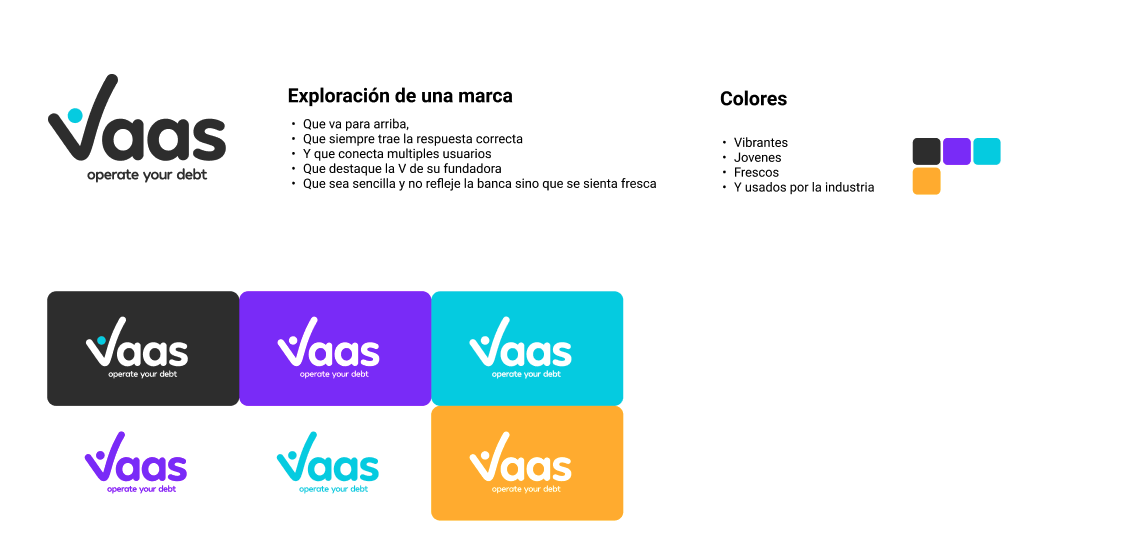
The Challenge
I knew that what awaited me was sleepless nights, and so it was. For about 3 or 4 days, I dedicated myself day and night to trying to get inside Valen's head. There were concepts that echoed in my mind besides debt, originators, debt providers; I always heard her talk about the universe, the obsession with mathematics, astronomy, purpose, curiosity, connecting many dots, and so on. Between reading, searching for ideas, and connecting V's vision (if I had had ChatGPT, I might not have stopped sleeping those days), I found several things:
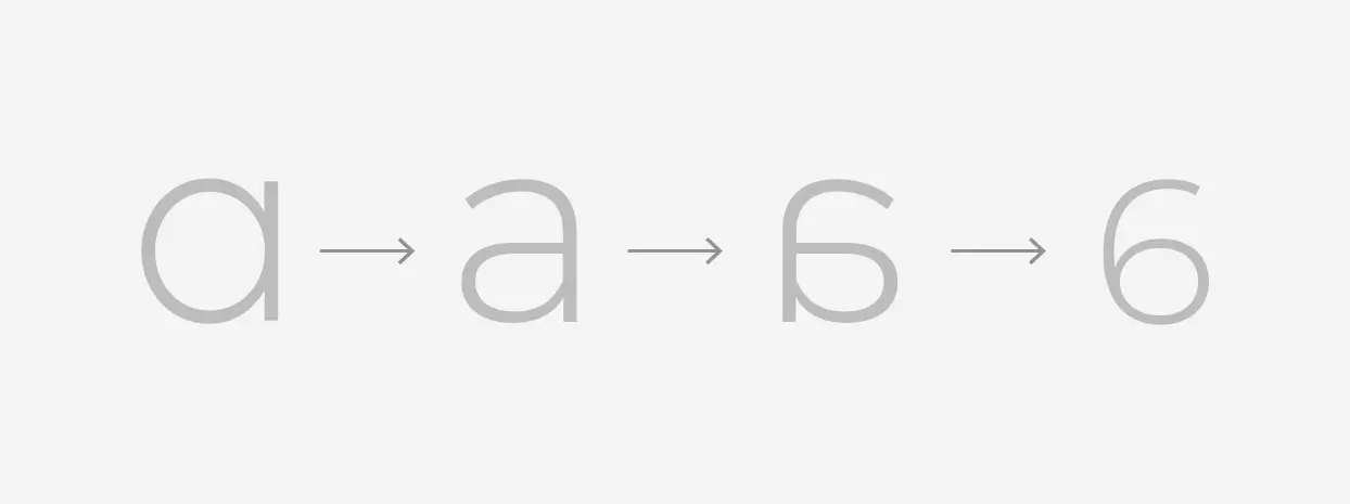
The first thing I thought was that those two As should help me connect something. We had just explored them in their modern Latin script, and I tried to see how they would look in Roman or serif, as it is commonly known. One of those two inverted As would help represent a number within the logo; in this case, by inverting the "A," there was a 6. Then I started reading about the theories surrounding the number 6, its numerical significance, Tesla's theory of 3-6-9, among other things.
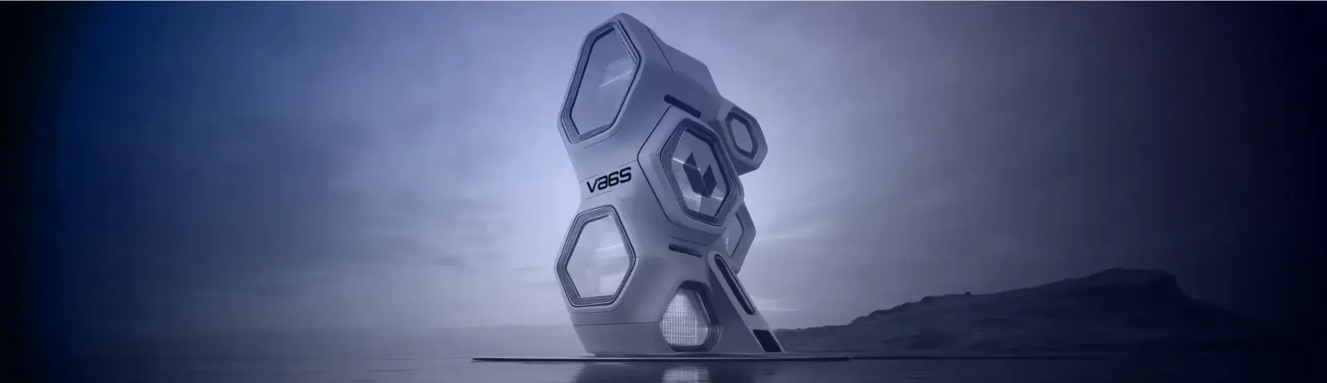
The mystique
That 6 was the entry to explore that icon; I knew I wanted to connect the isotype (icon) with the logotype (the letter). And here came the universe; the sixth planet from the sun is Saturn, and curiously, this planet has a hexagon at its north pole, and in one of its phases, depending on the temperature, it appeared as an absent region. If you want to read about this curiosity, here it is.
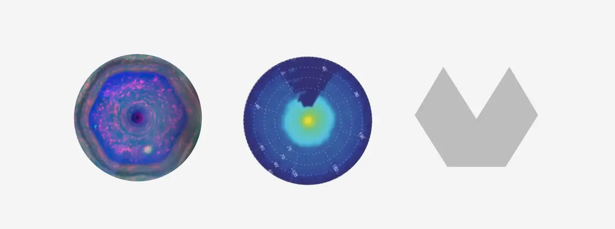
So I played with forming that hexagon with two parts connected by a thread that represent:
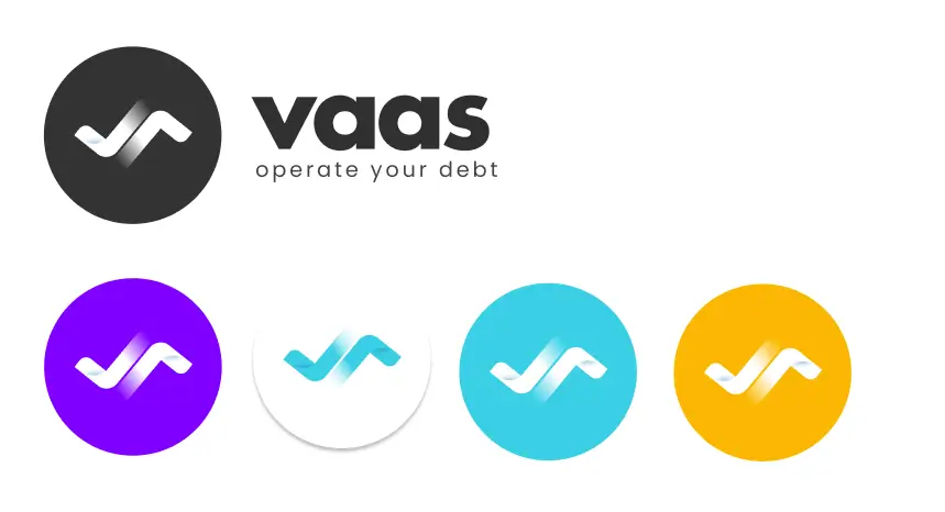
• In purple tones in its gradient to Originators: this color is associated with mystery, creativity, spirituality, vision, authenticity, imagination, madness, and creativity.
• In blue tones in its gradient to Debt Providers: this color is associated with serenity, protection, calmness, peace, trust, commitment, economic power, truth, and seriousness.
• The thread or border in turquoise or cyan to our platform: The place where these two parts meet, originators and debt providers. The color is associated with wisdom, sincerity, intelligence, transparency, and honesty.
For the font, I chose a trending one at the time; time was running against me—click, clack, click, clack…
I took a chance with Valen to see if I had hit the mark with the idea.
Fortunately for her, she loved it; we felt the same connection. We had a logo for the deck, and that was a milestone. The first meeting was in 3 days, and we needed to start running with the next steps; the PowerPoint presentation is another story.
The feeling of having something that we both liked, something that represented Valen's vision, was incredible. However, personally, it didn't completely satisfy me. It had an amazing story behind the creation of the logo, but the font broke that feeling.
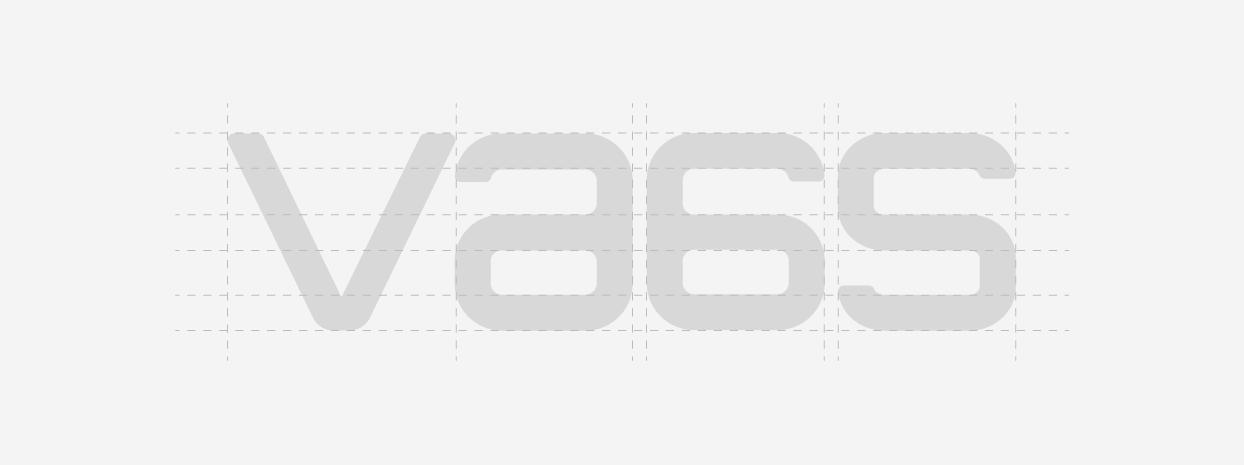
So, I set out to create a unique typography for that icon that would provide harmony, something unique that wouldn't look as sharp as the icon nor as organic as what we already had, and it ended up looking like this:
The final version
Many in my circle of designers and brand managers have asked me very valuable questions regarding the final version, like, "What if you had done this or that instead?" I feel that a brand should endure, but the logo must be a constant evolution that aligns with the development of the company. Just look at examples from the world's great brands, like Apple, Coca-Cola, Lego, etc.
If they ask me if this is the final_final.final.ext version for all time, I don't know; let's let our story be written. For now, it was the logo that stood behind the idea, not of the $500K, but of the $5M USD, and it has organically become the brand that has connected us for over two years and with which we have dreamed of reinventing the capital markets operation in Latam.